

Improved Polar Plot Utility
There’s a new feature in version 5.0 of the APx Polar Plot Utility: Users can now automatically transfer the measured directivity data to a contour plot in a third-party software package called VACS.
Polar Versus Contour Plots
A polar plot usually displays the normalized response of a speaker or microphone versus measurement angle at one specific frequency. In a multi-plot view such as the one shown in Figure 1, each trace represents a different frequency. This is useful in that it allows you to see the directivity effects. For example, from the plot in Figure 1, it’s easy to tell that this speaker is more or less omnidirectional at 250 Hz, and its response becomes increasingly directional at higher frequencies. The disadvantage of a multi-plot, however, is that it’s difficult to examine more than a few frequency slices at a time. Even with 6 frequency slices, the plot in Figure 1 is quite “busy”.
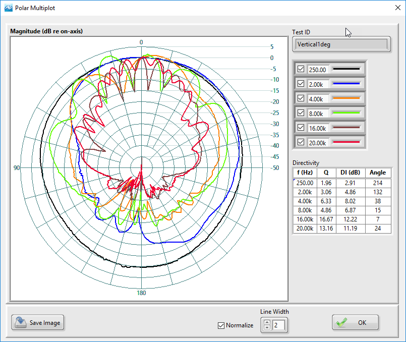
Figure 1. Polar Multiplot view from the APx Polar Plot Utility for a speaker measured with one-degree angular resolution.
A contour plot has the advantage that it displays the directivity information for all frequencies simultaneously. Figure 2 is a contour plot of the same loudspeaker polar measurement data plotted in Figure 1. The horizontal axis represents frequency over the entire measurement range (100 Hz to 20 kHz in this case) and the vertical axis represents the measurement angle over a 360-degree range centered on the zero-degree (on-axis) position. In a contour plot, level is represented by color, with the color map shown to the right of the plot. This presentation makes it very easy to see the how the directivity of the device changes with frequency.
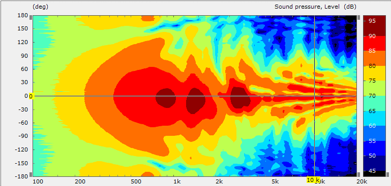
Figure 2. Contour plot of the same speaker directivity data shown in Figure 1.
VACS Software
The contour plot in Figure 2 was made using a third-party software application called VACS, developed and sold by R&D-Team of Germany (www.randteam.de) for visualizing, processing and organizing acoustic measurement data. It’s available for purchase online, or the VACS Viewer is available as a free download. The free viewer has essentially the same features as VACS, but does not allow the saving of any project files.
Once VACS or the VACS Viewer has been installed on your PC, directivity data measured with the APx Polar Plot Utility can be transferred to a contour plot in VACS by simply clicking the “Export (VACS)” button on the Polar Plot Response Data window. This will open the VACS software and create a new contour plot project with the measured data.
Figure 3 shows a contour plot view in the VACS application. There are four main views shown: the contour plot in the upper left, a polar plot in the lower left, a frequency response plot in the upper right and a “beam width” plot in the lower right. The polar and frequency response plots are slices through the 3-dimensional contour data at a frequency and angle selected by the position of the rectangular cursor in the contour plot. Each time the cursor is moved, the polar and frequency response plots are updated to show curves for the selected frequency and angular position.
The beam width plot is keyed to a level cursor on the color map legend to the right of the contour plot. It shows angle versus frequency for the level selected by the cursor.
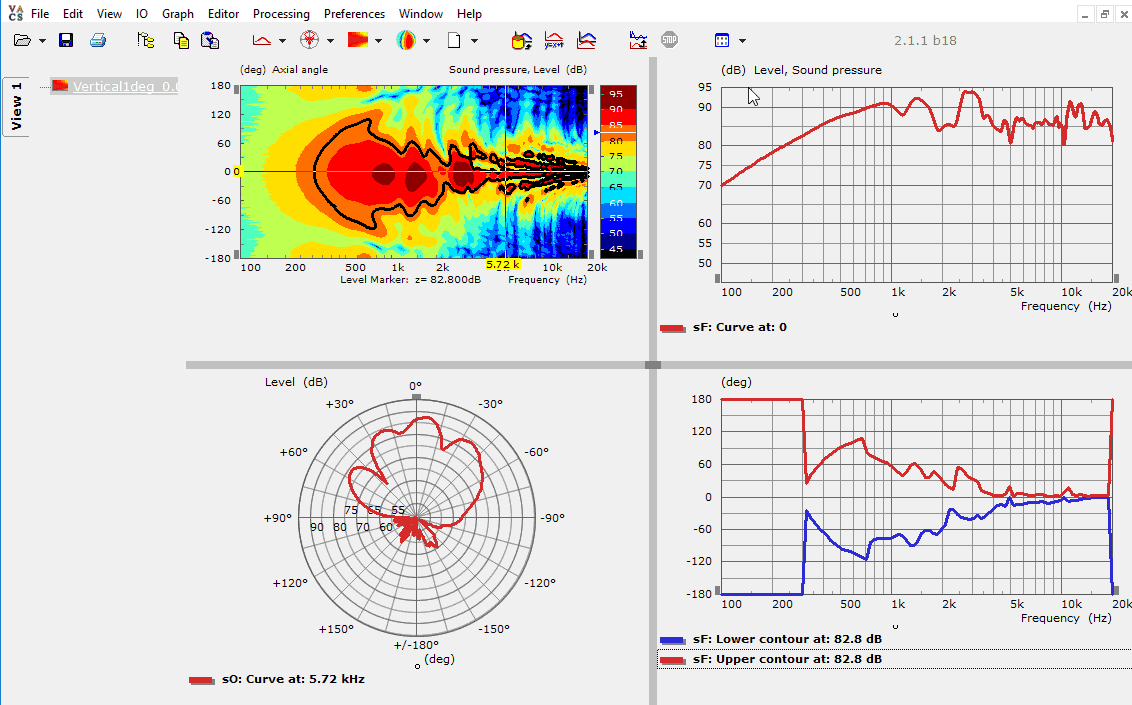
Figure 3. A contour plot view in VACS.
Contour plots can be another useful tool when measuring and analyzing acoustic directivity data with APx500 audio analyzers.
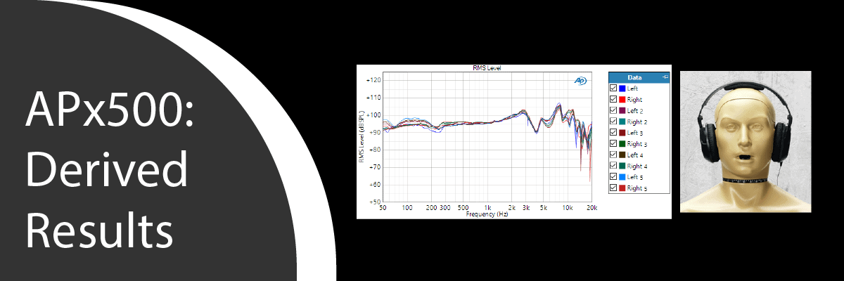
In this post, we discuss Derived Results in the APx500 software, another useful capability to help satisfy your audio test needs.
Read more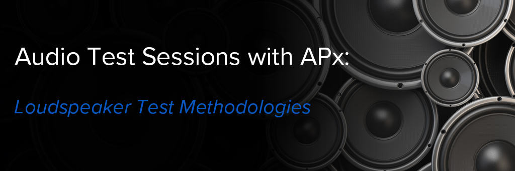
New Video! Mike Martin walks through key loudspeaker test methods, typical test setups and then demonstrates a variety of measurements.
Read more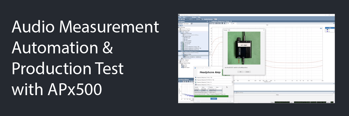
New Video! In this session, Joe Begin provides a detailed discussion of how to use a variety of automation and production (or manufacturing) test-oriented features.
Read more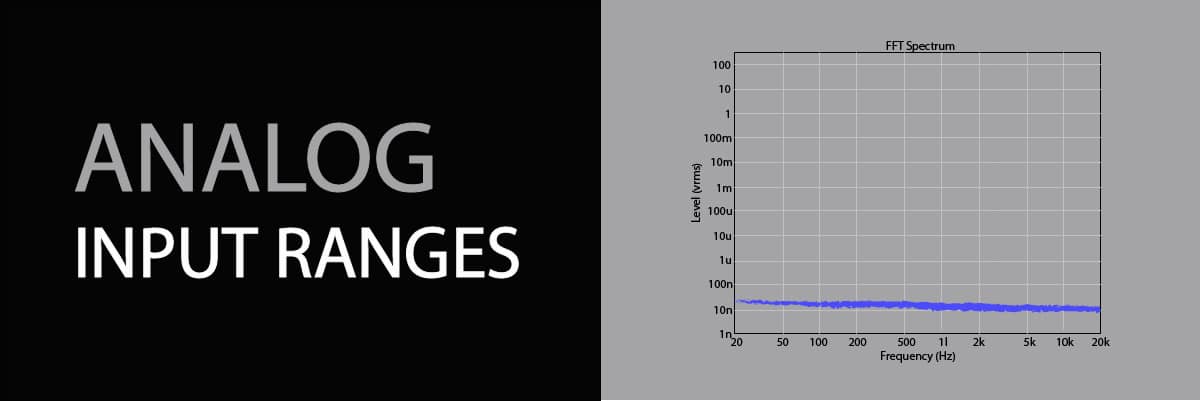
Using version 5.0.1 of APx500 software (released April 2, 2019), users can configure the analog generator to stay in a fixed output range. This is especially useful for testing acoustic devices, and some electronic devices.
Read more