
How to Plot Multiple Measurement Data Sets on One Graph
Often, users want to conduct measurements on a batch of devices and display results on one graph, to compare them. The APx Sequence is designed to display the results for one device at a time. If the PC has Microsoft Excel, here is a procedure you can use to get multiple device data sets on the same graph.
-
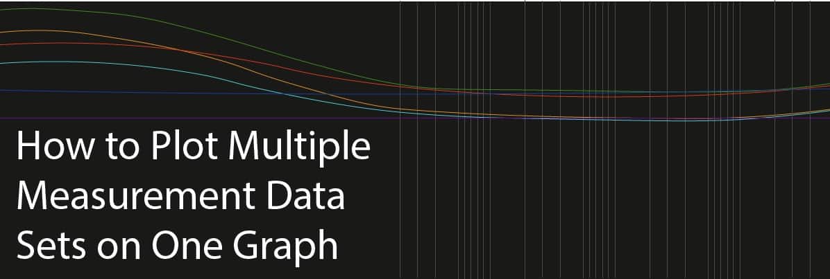
- 1. In the Navigator, check the Device ID prompt in Pre-Sequence Steps. This will prompt you to enter the Device ID each time the sequence is run, as shown below. Alternatively, you could create a prompt anywhere in the sequence and store the user entered value to a user-defined variable. Internally, the response entered is captured and assigned to the specified variable.
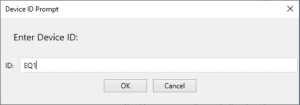
Figure 1: Device ID prompt window.
- 2. For the measurement and result of interest, create a sequence step to Export Result data to an Excel file. Use a Data Specification other than Same as Graph, to ensure that the same X-axis values are exported for each data set. Choose Append if File Exists, but do not check Y Data Only. Check the Insert Variable in Header checkbox, and specify the DeviceId variable (or your user-defined variable, if you used one in step 1).
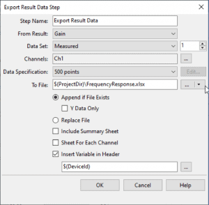
Figure 2: The example above exports the Gain result from Frequency Response.
- 3. Run the sequence for each device you want to test. This will append a data set as an additional pair of X and Y columns to the same worksheet in your Excel file for each run of the sequence.
- 4. When the measurements are complete, open the export data file in Excel. You can’t import this data to a single result graph in APx, but by editing it slightly, you can use the Define New Result feature of APx to plot all the data sets on one graph.
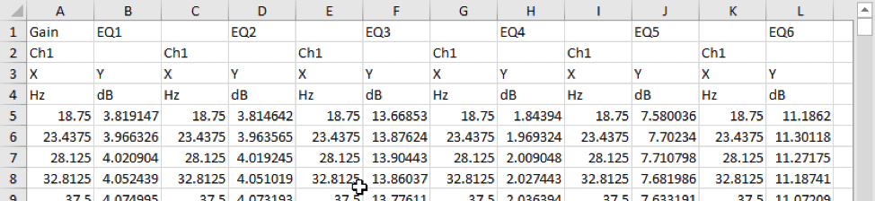
Figure 3: The screenshot above shows a file created from 6 Gain measurements using Frequency Response.
- 5. Here are the required edits:
- a. Change the title in cell A1, if you wish.
- b. Cut the DeviceId values from the top row (in this example, EQ1, EQ2, …. EQ6) and paste them in place of the channel labels (Ch1, Ch2, ….. Ch6) on Row 2.
- c. Edit the X and Y headers in Row 3. These will be the X and Y axis titles. So in our example, X is changed to Frequency and Y is changed to Gain.
- d. Save the file over top of the original, or as a new file, as you wish.
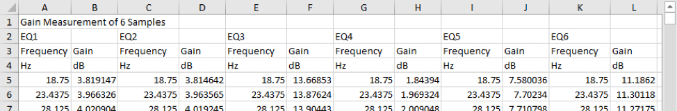
Figure 4. The edited version of the file for this example looks as shown above.
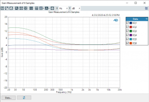
- 6. In the APx software, right click on any measurement and select Define New Result – (X,Y). Click on the button labeled Data… below the graph and use File control to select the file you just edited in step 5, by browsing or using variables. The graph will have a linear X-axis by default, but you can change it to logarithmic afterward, if required. This will plot all the data sets on one graph, as shown below. Note that the Device ID strings entered for each run appear in the graph legend, to help identify the data sets.
APx500 Software provides two distinct tools for verifying a device's capacity to playback a signal for an extended period of time.
Read more
Benchmarks. They are vital to ensure the R&D team produce a compelling new product or service and are essential on the production line of a manufacturing facility.
Read more
Introducing a new way to access all the latest APx500 software versions
Read more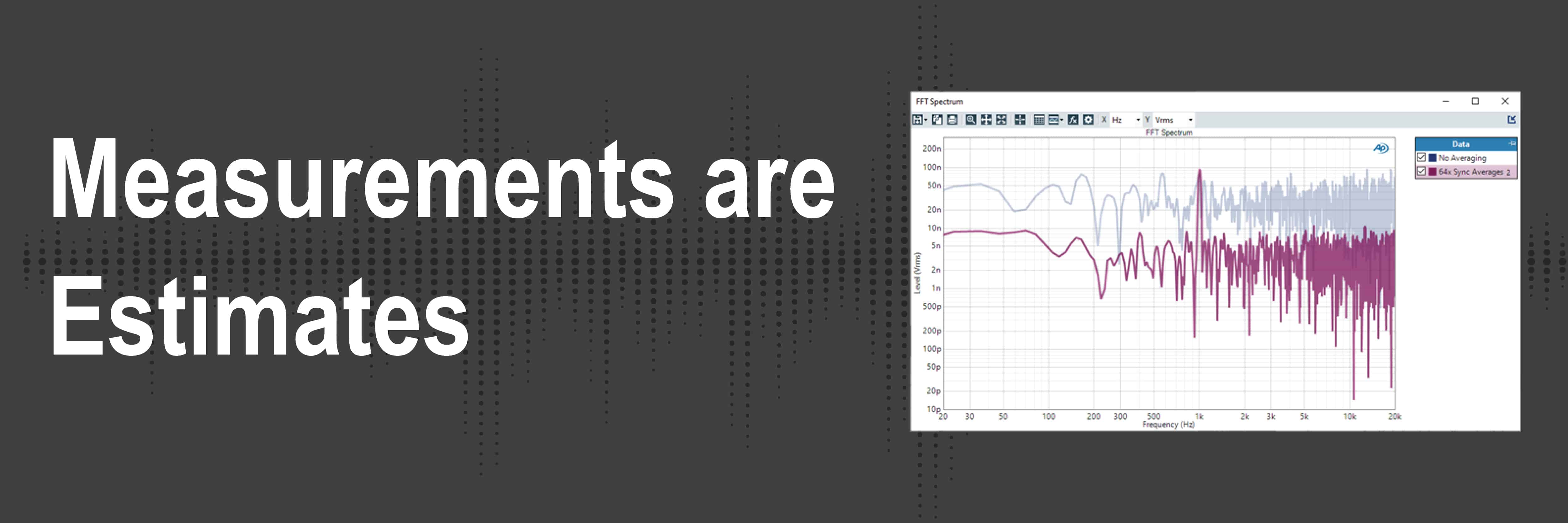
Understand how audio analyzers’ measurements are not absolute truths but are more so estimates.
Read more